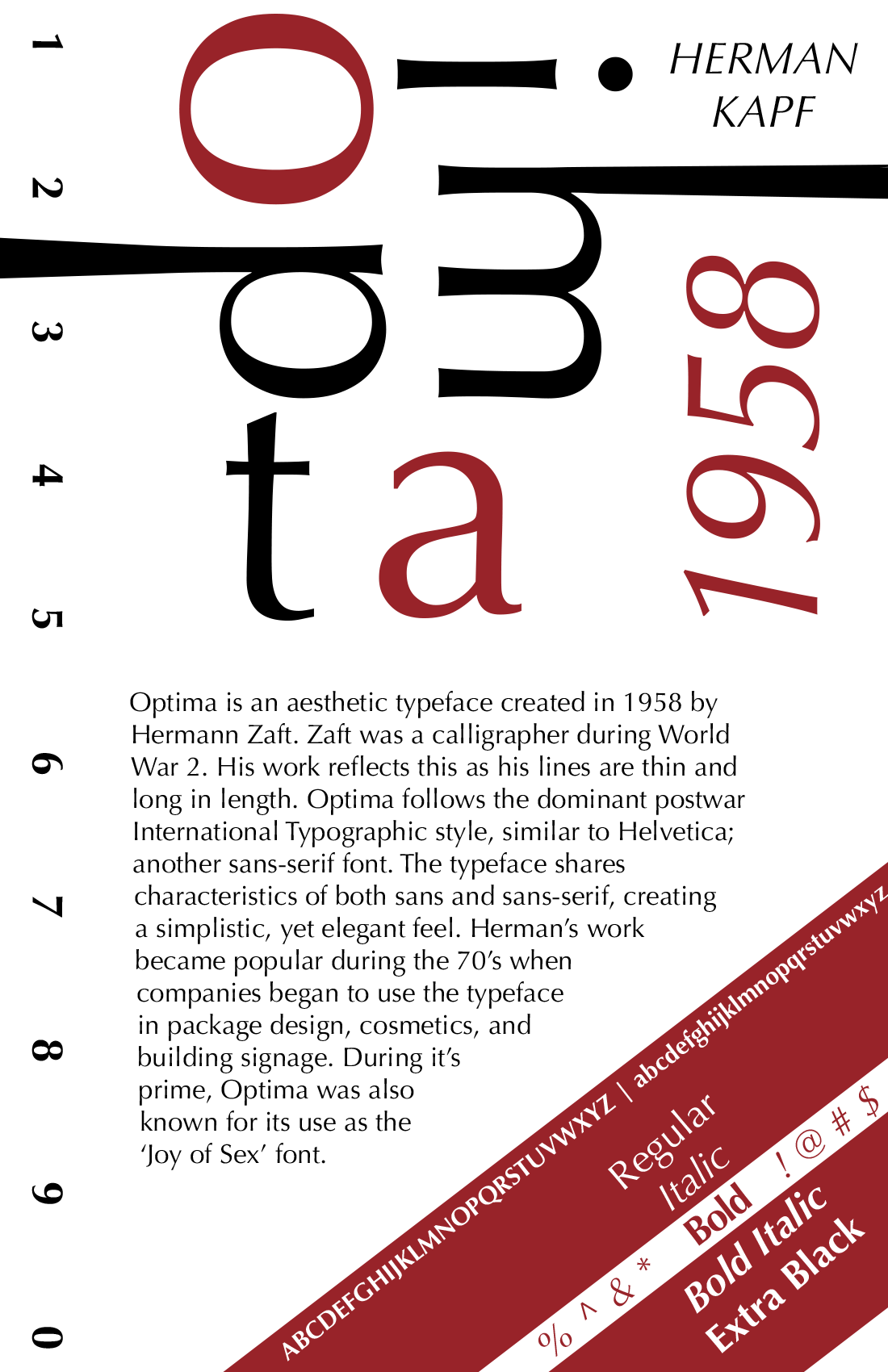
Optima
Typeface poster
INTRODUCTION
2025
GID270
Typography
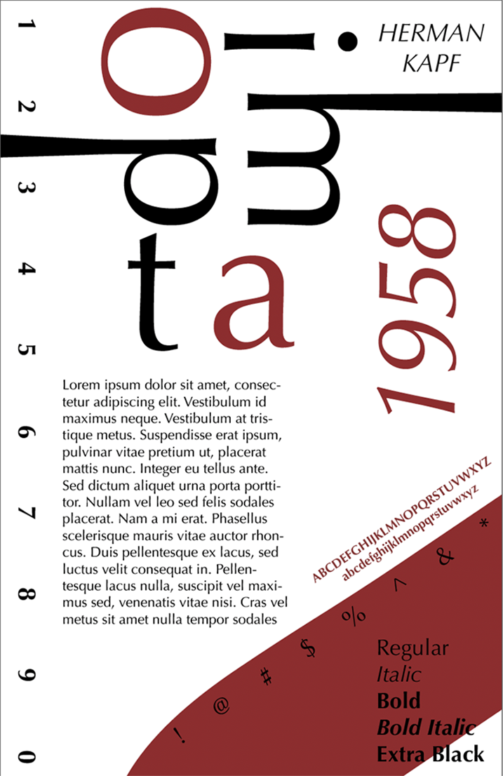
This project is a typographic poster exploration using the Optima typeface as the sole visual element. The design investigates how composition, scale, and hierarchy can create visual interest using only one typeface.
CONCEPT
The concept centers on understanding how subtle differences within a typeface — such as weight, spacing, and proportion — impact tone, readability, and visual balance. By working within a strict constraint, the design highlights how small typographic decisions can significantly influence the overall composition and viewer experience.
PROCESS
The process began with experimental layouts to test how the type could function as structure itself. Drafts explored scale, rotation, alignment, and weight to build hierarchy and flow while maintaining cohesion. Refinement focused on tightening spacing, improving balance, and ensuring the typography carried both the visual impact and informational clarity of the poster.
FIRST DRAFT
FINAL POSTER